St Collumba's is a girls school of around 990 students and 120 staff. It is a catholic faith school in what I am told is the largest catholic area in Australia, over 90% of the pupils come from catholic backgrounds.
The main reason for today's visit was for Peter to see the completed 'Learning Courtyard' he had designed but we also had a very comprehensive tour of the school, guided by Chris Bence, of the new and old classrooms. It was interesting to compare and contrast the difference of the old and the new. Not just from a design perspective but also from a learning and teaching perspective. In my opinion the pupils seemed more energised when in the newer layouts compared to the traditional row type layout that we are all familiar with.
I have proposed for some time that HE should look to the secondary sector to establish what the leading schools are doing in regard of learning and teaching spaces. It was apparent to me today, as it was at Methodist Ladies College, that we could take much of what I saw and drop it into any university to great effect. Of course this had Peter's prints all over it so I have already seen similarities between St Columba's , MLC and the University of Melbourne.
Pic 1
The quite beautiful front of the building. You can just make out seating with young trees on the paved area. This area is currently not open to the pupils for various reasons but I believe that the intention is to do so.
Pic 2
This is a view up into the learning courtyard. The snake on the right hand wall is a mosaic produced by pupils. It has turned what would have been a drab brick wall into a place of interest
Pic 3
One of the zones in the courtyard with different height surfaces. The materials looked very robust and would even suit a UK climate.
Pic4
An aerial shot. There are 6 spaces within the overall space and 5 are visible here. Chris informs me there are often upto 200 pupils in this space.
Pic 5
The biggest of the 'zones'. The bar type arrangement are higher than the teardrop table which is used as a larger work surface.
Pic 6. and 7
This room was a traditional class room and hold 30 students. The brief was to redesign the space whilst being constrained by the room dimensions and the room capacity. They were not negotiable. By changing the table shape to the teardrop one that we are now all familiar with the circulation space has improved dramatically. There are 5 tables each with a wall mounted associated writing surface except for one which is being addressed. When asked the girls said they liked being able to see each other when at the table, have loads of space for their kit ( look at the amount on the table) and having the writing surfaces was great as they could stand up and work. I think there is a lot of energy in these two pictures.
Pic 8
A more traditional layout that we see in most schools and universities. As they say a picture paints a thousand words. This is not meant as a criticism of the school or the staff but an observation. The point is change is required throughot education. St Columba's has made a very good start.
Pic 9
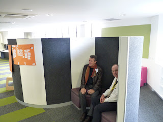
An 'S' shaped partition that is in what was an corridor type area outside two classrooms. This area is used by the pupils to chat about projects or have a quiet moment etc.. What Helen pointed out to me was that once you sit in the area where you see Peter and Chris your voice instinctively lowers and the space becomes quite intimate. This confirms my belief that we all too often ignore human instinct in design. It is deep seated and has great influence on the way we interact with space.
Pic 10
This is Peter sat on a funky little, portable seat. I can see many places where these would be used, They have a carrying handle, are light and comfortable. They can also be configured as a table when two or more are connected, similar to a puzzle. They are made by Lummel but I suspect there are similar things on the market


No comments:
Post a Comment