Yesterday, Monday, Peter finally had some time in his busy schedule to visit and explain the concept behind some of the spaces he has designed or been involved with at various levels.
Before I post any pictures I want to comment about the wide variety of spaces, learning and social, that Peter has been a major contributor to, and more often than not the visionary.
We visited the School of Engineering, which I had visited last week but I noticed different things this time. The Eastern Precinct Learning hub with it's indoors and outdoor elements, the School of Law and the School of Chemistry.
I posted some pictures of The School of Engineering in blog 8 so will not add any here. Peter mentions in a comment to blog20 that he introduced the element of play into the labs. This was apparent when I visited even though the students were not on the floor as described there was an element of play being demonstrated by the students working on robotics on the work desks. I don't think this would occur if the ethos was not established in the overall design.
There were areas that were quite dark and forbidding for my tastes but I will let Peter and Brian explain about those areas. Overall the school had a male dominated feel to it as I explained yesterday. The gender element does need to be considered, there were a lot of female students. Does, should the discipline inform the design? Discuss.
The Eastern Precinct Learning Hub was a revelation. Light where there had been dark, transparency where there had been seclusion. Peter that the transparency was important in this project. His aim was to create spaces where a person could see through, over, around in , across between and out of the space they occupied or whilst travelling through the space. He has succeeded.
This picture demonstrates the power of natural light and also connecting the inner and outer landscapes. Something I am very keen on as inspirational tools.
 Here we have a small pod. Note that the students are maximising the use of available space.
 As an aside I have noticed a trend here repeated at Aberystwyth which is that the students use the provided computer as well as their laptops. It seems that one IT source is becoming inadequate! Lets see what I discover at Flinders and Queensland.
 This picture demonstrates what design features have been used to achieve transparency. As you walk past this corner you can see into the work space but of course people in the work space also look out at passing traffic.
This another great example of transparency. This shot was taken from a stairwell and major thoroughfare.
I was intrigued by how the one view gave two messages. The lower level is a busy helps desk area, the upper level is a quite study space.


I suspect this space would be hard to get permission for in many of our institutions. It is a lounge area that would enhance most hotels, airports or even homes. Very nice ambiance with people studying, chilling, and sleeping.


Before I post any pictures I want to comment about the wide variety of spaces, learning and social, that Peter has been a major contributor to, and more often than not the visionary.
We visited the School of Engineering, which I had visited last week but I noticed different things this time. The Eastern Precinct Learning hub with it's indoors and outdoor elements, the School of Law and the School of Chemistry.
I posted some pictures of The School of Engineering in blog 8 so will not add any here. Peter mentions in a comment to blog20 that he introduced the element of play into the labs. This was apparent when I visited even though the students were not on the floor as described there was an element of play being demonstrated by the students working on robotics on the work desks. I don't think this would occur if the ethos was not established in the overall design.
There were areas that were quite dark and forbidding for my tastes but I will let Peter and Brian explain about those areas. Overall the school had a male dominated feel to it as I explained yesterday. The gender element does need to be considered, there were a lot of female students. Does, should the discipline inform the design? Discuss.
The Eastern Precinct Learning Hub was a revelation. Light where there had been dark, transparency where there had been seclusion. Peter that the transparency was important in this project. His aim was to create spaces where a person could see through, over, around in , across between and out of the space they occupied or whilst travelling through the space. He has succeeded.
This picture demonstrates the power of natural light and also connecting the inner and outer landscapes. Something I am very keen on as inspirational tools.


This another great example of transparency. This shot was taken from a stairwell and major thoroughfare.
I was intrigued by how the one view gave two messages. The lower level is a busy helps desk area, the upper level is a quite study space.

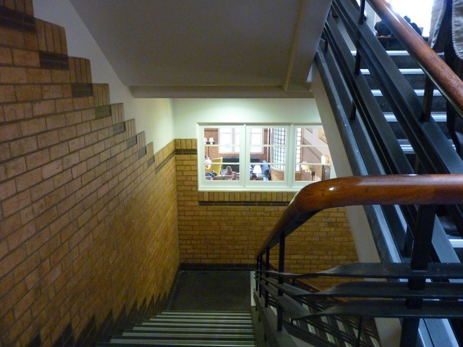
Another example of transparency. This used to be a brick wall. Note how the window makes the stairwell a more interesting place.
Here we have lots of daylight, teardrop tables, group and private study capacity.

I have noticed that Peter uses the natural wood grain on the tables to lift the spaces. I think this is far more attractive than some of the manufactured finishes. How many of us introduce wood finishes at home? I use it a lot I suspect because of its natural qualities.

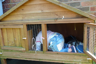
Talking about spaces, play and unexpected uses here is picture of my granddaughter using the rabbit hutch in a way not envisaged. Actually she was not considered at all during the design stage.
See what I mean about instinctive behaviour. She saw a space and thought she would make best use of it. Before you all rush to report me to social services it had been cleaned and the pets long since gone to the hutch in the sky.

This is an interesting picture.
The work surface that Peter is close to is at about a 60 degree angle to the wall it is inserted into. The surface starts one side of the wall and continues through. The effect is almost an optical illusion in so much as the columns you can see within the ‘room’ seem to be at a strange angle also adding interest to the overall visual impact. What you don’t see here is that directly behind the wall there are two people studying. You seem that as you approach the openings either side of the wall.
I think this picture also demonstrates the transparency theme. I think many ‘designers’ would have put the work surface at 90 degrees to the wall hence losing the overall impact. I liked this area very much. It is a quality piece of design that meets it's objective. Pictures cant' do it justice as it is a difficult place to photograph but a great place to work. That was demonstrated by the number of students that were using the space.

Let’s move outside.
Many of those viewing this blog would have seen pictures of ‘The Pavilion’ designed by Cox Architects with peter. I have to say that pictures do not do it justice and whilst I was there lots of activity going was apparent
Activities such as reading a book, using a computer, eating lunch, listening to the piped music (not lobby music, praise be), waiting to meet someone, people watching, resting, passing through and I suspect others I had not identified. A great space and I want one.
I know James Rutherford will be very excited about visiting this area and will no doubt wax lyrical about it and add more in depth commentary to the above.


The School of Chemistry
Once again many will have seen pictures of this space. When we visited I was lucky enough to be able to talk to a lecturer who uses the space. She felt inspired when teaching in there but the comment that says it all was ‘ when I teach in here I can get the students to collaborate and do some work. When in a traditional lecture space I end up doing the work for them’
This of course is because traditional spaces do not lend themselves to collaborative or problem based learning. This is not surprising as they were never designed to do so. The problem is we tend to gravitate towards this formula. In an earlier blog I referred to Lawson and what he says about traditional


I love the transparency theme that PJ is using in these spaces, I know that from my own limited experience, students actually quite like being on show! A bit narcissistic maybe but its all about community and showing how dynamic universities are.
ReplyDeleteI also admired the lighting they have in the photo with the 3 asian girls working with laptops, looks like Pizza express!
James, a good point you picked up on, that is lighting!!! A very important element to the design of the learning space yet another one that estates and maintenance balk at. Peter has demonstrated very effectively in his designed spaces how good lighting impacts on the space and the overall student experience. Oh how I wish estates people and architects could be more imaginative.... Az.
ReplyDelete