Friday afternoon I gave a presentation to an invited audience about the change of Rosser and PJM student bars to 24\7 student learning centres. Thanks to Peter for arranging this and to all those who took the time to attend.
Amongst those who attended were the University Librarian and Deputy Librarian and their colleagues, the AV team which are usually involved in the space design process, architects from the university and private practice, designers including a landscape designer and academics from the School of Architecture.
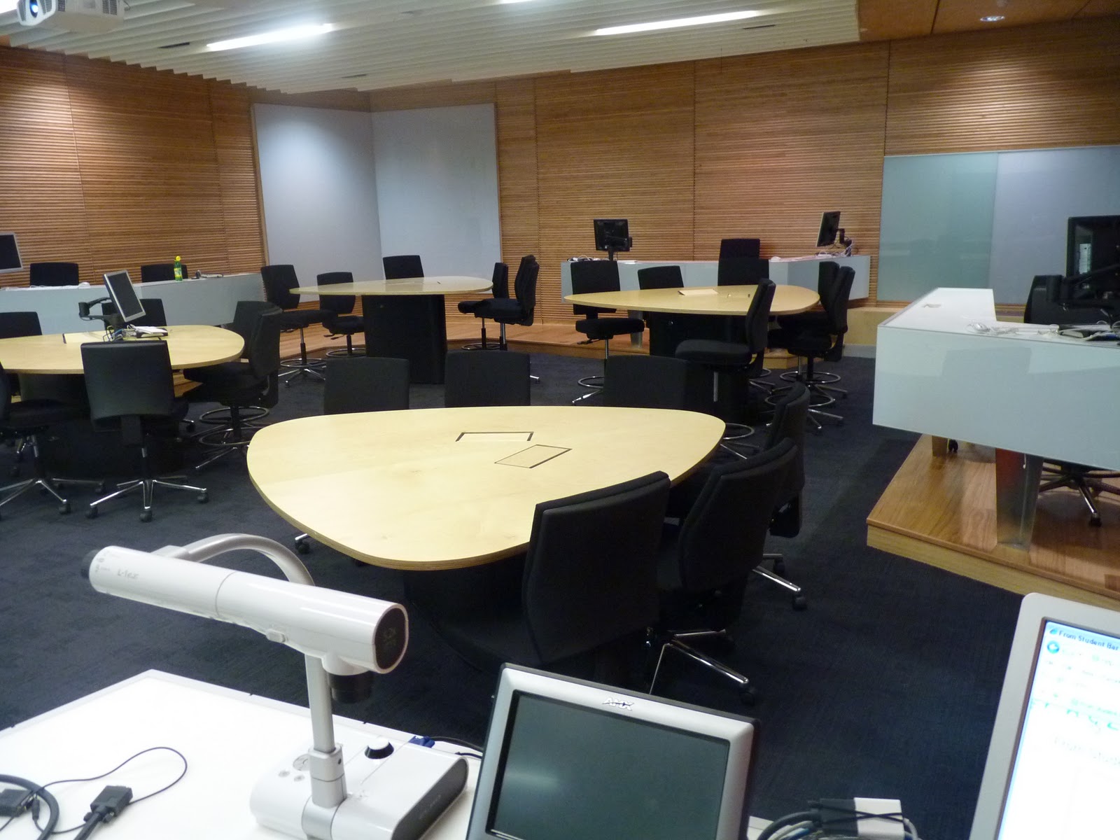
It was held in a recently finished collaborative teaching space (pics below) designed by Peter Jamieson with Peter Schrueder of Blomquist and Wark. The AV\IT was designed by John Peacocks AV team. Thanks to Carlo for sorting the audio out for me.
This was a different experience from presenting in a traditional space i.e. rows of seats. The space is easy to manoeuvre through if required and had several natural teaching locations especially on a slightly raised area at the opposite side of the room to the teaching lectern. The teardrop tables are designed to allow the audience to keep in contact with the presenter as he or she moves around the class. There are glass writing surfaces throughout the room allowing the teacher the freedom to use the complete area of the room to. I particularly liked the sliding glass writing surface on the main teaching wall. The space comes together in a holistic way and works. Interestingly there are no windows so no natural daylight in there but I think the use of the glass writing surfaces in different colours around the room helped alleviate this. I wonder what others present thought?
There are direct comparisons to be made with the space I presented in and the ones I was presenting about. The most striking one is the use of zones within the space. Although the space I presented in was designed for collaborative teaching and the spaces I presented about are non teaching spaces the use of zones enables the rooms to function in many ways. Of course there is collaboration going on in both types of space and the use of zones allows this to happen.
Peter told me of a project meeting held in the room where he insisted that one of the tables be removed to improve the spatial qualities of the room both visually and functionally. I think he was correct about this. An extra table would have altered lines of sight and maneuverability of students and teacher detrimentally
Some of the questions asked were: what was learned from the projects and what improvements could be made? How I involved the students? And have the projects been a success? I think the biggest improvement we could make is to introduce glass writing surfaces if the aim is to get students to collaborate on projects outside of the classroom. The involvement of students was done by observation, organised feedback (survey) and adhoc feed back (talking to them in the space). I would like to take this to the next level and get them involved from the start of a project. Perhaps even finding out what ideas students have prior to any project so that the information can be fed into any project early.
I discussed with Richard the landscape designer that, whenever possible, we should link the outdoors with the indoors. The Land and Environment project I wrote about in an earlier post is a good example of this. I hope to return to get more photographs.
Some pics.
This is from the back of the room with teaching wall in the distance. The centre white are supports dual projection and the two greenish side panels are sliding glass writing surfaces. The teaching lectern is on the left.


This demonstrates the different table heights better.
 This is the view from the lectern with the glass surfaces prominent and the two raised areas with white work surfaces to the left and right.

Amongst those who attended were the University Librarian and Deputy Librarian and their colleagues, the AV team which are usually involved in the space design process, architects from the university and private practice, designers including a landscape designer and academics from the School of Architecture.
It was held in a recently finished collaborative teaching space (pics below) designed by Peter Jamieson with Peter Schrueder of Blomquist and Wark. The AV\IT was designed by John Peacocks AV team. Thanks to Carlo for sorting the audio out for me.
This was a different experience from presenting in a traditional space i.e. rows of seats. The space is easy to manoeuvre through if required and had several natural teaching locations especially on a slightly raised area at the opposite side of the room to the teaching lectern. The teardrop tables are designed to allow the audience to keep in contact with the presenter as he or she moves around the class. There are glass writing surfaces throughout the room allowing the teacher the freedom to use the complete area of the room to. I particularly liked the sliding glass writing surface on the main teaching wall. The space comes together in a holistic way and works. Interestingly there are no windows so no natural daylight in there but I think the use of the glass writing surfaces in different colours around the room helped alleviate this. I wonder what others present thought?
There are direct comparisons to be made with the space I presented in and the ones I was presenting about. The most striking one is the use of zones within the space. Although the space I presented in was designed for collaborative teaching and the spaces I presented about are non teaching spaces the use of zones enables the rooms to function in many ways. Of course there is collaboration going on in both types of space and the use of zones allows this to happen.
Peter told me of a project meeting held in the room where he insisted that one of the tables be removed to improve the spatial qualities of the room both visually and functionally. I think he was correct about this. An extra table would have altered lines of sight and maneuverability of students and teacher detrimentally
Some of the questions asked were: what was learned from the projects and what improvements could be made? How I involved the students? And have the projects been a success? I think the biggest improvement we could make is to introduce glass writing surfaces if the aim is to get students to collaborate on projects outside of the classroom. The involvement of students was done by observation, organised feedback (survey) and adhoc feed back (talking to them in the space). I would like to take this to the next level and get them involved from the start of a project. Perhaps even finding out what ideas students have prior to any project so that the information can be fed into any project early.
I discussed with Richard the landscape designer that, whenever possible, we should link the outdoors with the indoors. The Land and Environment project I wrote about in an earlier post is a good example of this. I hope to return to get more photographs.
Some pics.
This is from the back of the room with teaching wall in the distance. The centre white are supports dual projection and the two greenish side panels are sliding glass writing surfaces. The teaching lectern is on the left.

Below are three photographs of the new room in use for my presentation.


In short I think this is a great design and the people who will use it will enjoy doing so.
Looks great Nigel, looking forward to seeing these spaces, especially to get an idea of how the height variations work.
ReplyDeleteI don't think the height variations are adequate as very few students can benefit from them, it may look good but realistically from what I can see from the photo's only 4 seats are at a higher level !!!! Correct me if I'm wrong. They also seem to segregate those positions from the main seating area. I don't really know, maybe that was the intention !!!!! I do like the glass writing surfaces though, these are much more durable and easier to clean than VES surfaces when pens run out of alcohol.....
ReplyDeleteRegards
Az
The height variation is very subtle but effective. It is not too high that students become disconnected from the presenter, and high enough to establish clear sight lines without craning your neck. During Nigel's presentation I sat at the bar to the side of the room, which provided a different experience again - one I enjoyed very much. The experience of the room is vastly different to what you would expect from the photos. Photos are more difficult to read as dynamic spaces when they do not include people.
ReplyDeleteJo, I'm not convinced that this space is good overall. The majority of the people are on one level with only 4 persons slightly elevated, with IT facilities, whats that all about ? Have I missed something here !!!!
ReplyDeleteAz
Jo, yes you are correct when you say photo's are difficult to read and maybe I'm not getting the real feel of the space from the photo's. I'll have to get Peter to fly me out there to experience it ;-) Az
ReplyDeleteI was lucky enough to be at this presentation. We spoke later about how the act of designing, and the paradigms used, can be a determining force in project outcomes. How the big black dotted line on the plan indicating the 'Project Boundary' often alienates the project from its broader context, and how there might be better ways of both imagining and actively designing teaching and leaning spaces. From my perspective, as a landscape architect, I often see well conceived projects fail due to their lack on integration into the broader context. The whole indoor-outdoor experience is one we are just coming to grips with. Thanks again Nigel.
ReplyDeleteRicko
ReplyDeleteThanks for the comment. Succinctly put. The big black dotted line is a constraint especially when 'ownership' of the adjacent space is in question. This is especially so when the silo mentality is prevalent which, sadly, it often is.